

A tricky gold chart is making the rounds on social media.
The Bloomberg chart in question shows that gold just surpassed its 1980 all-time high, if you adjust for CPI (official government inflation).
Take a gander:
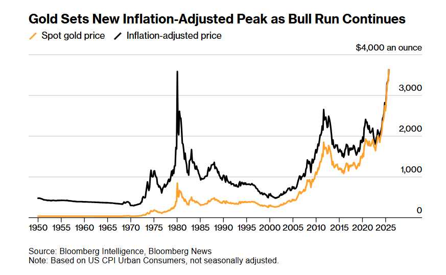
At first glance, this might seem scary if you own gold and miners. Some will be tempted to sell their precious metal investments based on this faulty chart.
The problem, of course, is that government inflation is a horribly flawed measure of price.
For example, if you look at CPI price data for new cars, the BLS tells us that the price of a new auto has increased about 2x since 1980.
However, the average price of a new car in the U.S. back in 1980 was around $7,600. Today it’s around $48,000, about 6x higher.
But CPI tells us that new car prices have only risen 2x since 1980? How come the actual price is up 6x?
This is a great example of how the BLS cooks the books on inflation data (CPI). They say that because modern cars come with electronic windows, airbags, and more efficient engines, the price is basically irrelevant. You’re getting so much more for your money, that the true price increase shouldn’t matter.
What matters, according to government statisticians, is the value received by the consumer. And that is completely subjective. So they use “hedonic adjustments” to make it seem as if inflation isn’t as bad as it truly is.
This manipulation is so pervasive across our society that almost everything is affected by it.
A Better Gold Measure
So CPI is a completely worthless way to adjust for gold’s inflation-adjusted price. What other metrics can we look at?
One of the most straightforward is M2 money supply. Here’s what a chart of gold’s price since 1980, adjusted for U.S. money supply, looks like:
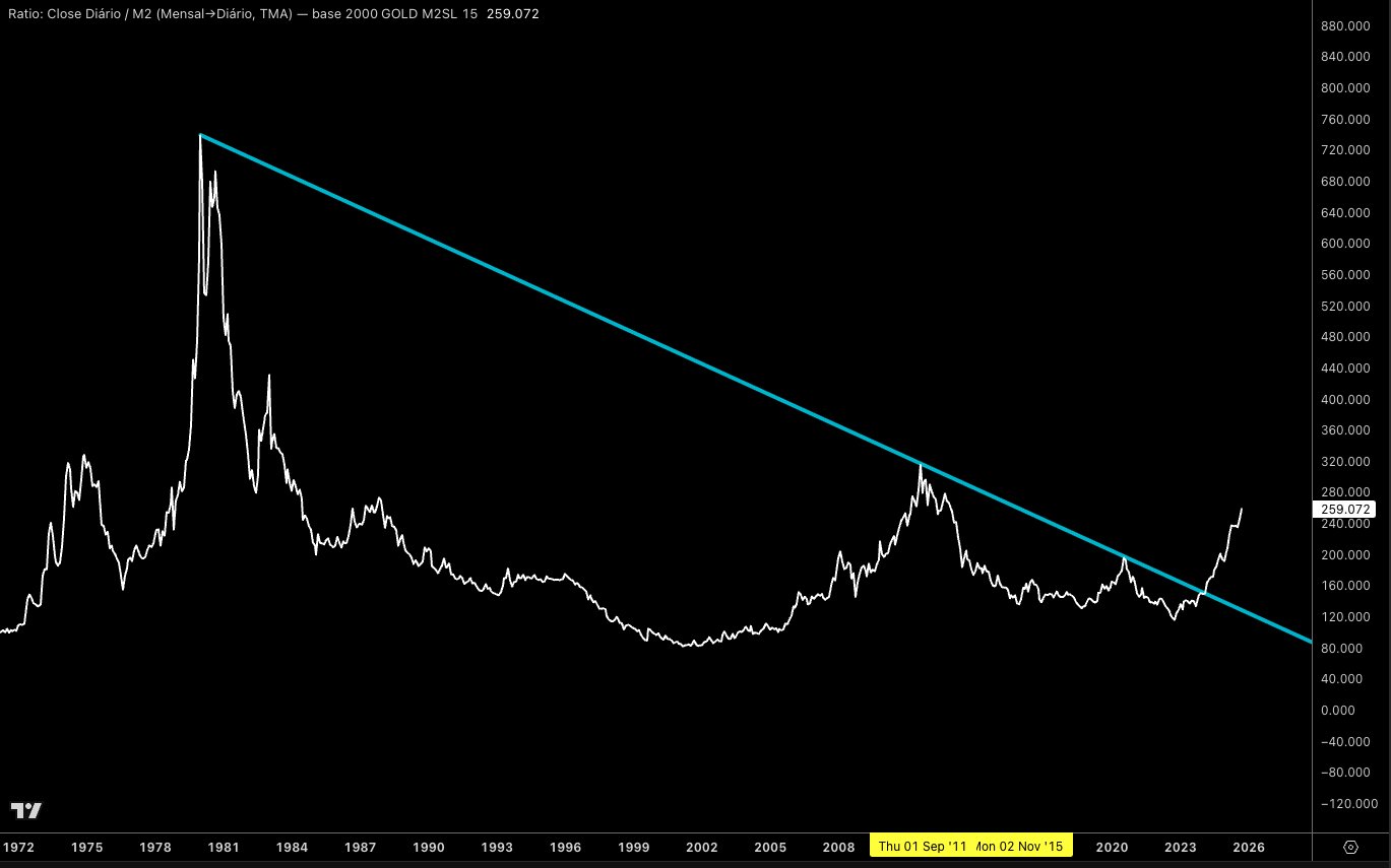
Source: J.P. Mayall
Now that’s more reasonable.
We cannot judge gold’s “true all-time high” by CPI, a critically-flawed measure of inflation.
One More Thing
The 1970s were no picnic. In ‘71 Nixon ended the last of the gold standard, setting off an inflationary mess. The oil embargo caused energy prices to spike to unprecedented levels.
But debt-wise, the ‘70s were tame compared to today. Federal debt-to-GDP levels started the decade off around 35% and ended near that same level.
Today America’s debt-to-GDP is over 120%. More than 3x higher.
The only time in recent history the U.S. has reached these levels was during WW2. We covered the “solution” back then, known as yield curve control, in The Fed Brews Up a Nasty Potion:
Yield curve control (YCC) was instituted between 1942 to 1951 because the U.S. had to issue massive amounts of bonds and notes to pay for WW2. Normally this supply dump would have caused interest rates to soar higher.
But 15% interest rates on the 10-year bond would have been disastrous to federal finances. So the Fed and Treasury capped long-term bonds at 2.5%. Short-term notes were capped at 0.375%.
Even as inflation reached nearly 20% annualized, government bond yields were suppressed at near-zero levels.
Make no mistake. The world is headed for multiple sovereign debt crises. Debt and deficit cannot be sustained at these levels.
Inflation is the most likely outcome. The Fed will print, yields will be suppressed, and savers and bond owners will take the brunt of the punch.
Hard assets offer excellent refuge. Gold and silver being the supreme choices here, naturally.
So when people say gold is looking toppy, or expensive, I have to laugh. They have no idea what’s coming.
Some still think this gold move is just another speculative mania. Nevermind that central bankers are the primary buyers.
When the guys who run the fiat printers are the ones gobbling up gold, that’s a sign this isn’t a regular move.
It’s a signal that something major is approaching. A monetary reboot, if you will.
Bottom line: don’t rely on government data to decide when to buy or sell precious metals. They have a strong incentive to mislead you.
For more on inflation-adjusted highs, be sure to check out Silver’s 3x Upside. There’s a lot more juicy data in that piece.